
Table of Contents
ToggleVictorian homes aren’t shy. From Queen Anne turrets to Italianate brackets, these architectural gems demand color schemes that match their personality, bold or refined, historical or contemporary. Whether you’re restoring a century-old Painted Lady or updating a Victorian-inspired home, choosing the right palette means understanding how the Victorians themselves approached color. They didn’t do builder’s beige. Instead, they used rich, layered hues that highlighted architectural details and made statements. This guide breaks down authentic Victorian color traditions, walks through proven exterior and interior schemes, and helps homeowners make confident choices that respect the style while fitting modern preferences.
Key Takeaways
- Victorian house color schemes traditionally use polychromy (three to five colors per façade) to highlight architectural details, with darker hues on lower portions and progressively lighter shades upward for emphasis.
- Painted Ladies feature bold multi-color approaches with a medium-dark body color, contrasting primary trim, secondary accent colors on ornamental elements, and detail shades—a timeless formula for ornate Queen Anne homes.
- Modern Victorian color schemes can achieve historical authenticity through subtle two- to three-color palettes using monochromatic, analogous, or neutral-plus-accent approaches that satisfy neighborhood design guidelines.
- Interior Victorian spaces traditionally employ rich, dark walls (burgundy, forest green, navy) in formal rooms and softer tones (dusty rose, sage, lavender) in private spaces, with contrasting trim and ceiling treatments.
- Success with Victorian exterior and interior colors requires testing paint samples on different facades in actual lighting conditions, understanding your home’s architectural substyle, and checking local historic district requirements before committing to a palette.
Understanding Victorian Era Color Traditions
Victorian-era color choices (roughly 1837–1901) weren’t arbitrary. Early Victorians favored earthy, muted tones, ochres, umbers, mossy greens, partly because synthetic pigments were expensive and natural pigments limited. By the 1870s, advances in paint chemistry brought brighter chromatic greens, deep reds, and golds into reach for middle-class homeowners.
Architectural paint manuals from the period, like those published by Devoe & Raynolds, recommended using darker hues on lower portions (foundation, porch base) and progressively lighter shades upward to emphasize verticality and grandeur. Trim colors contrasted with body colors, and decorative elements, spindles, brackets, gingerbread, often received a third or even fourth accent shade.
Key principles included:
- Polychromy: Multiple colors (three to five) on a single façade to accentuate architectural detail.
- Natural harmony: Colors inspired by minerals, foliage, and earth rather than artificial fluorescents.
- Social signaling: Bold color combinations on Queen Anne homes announced prosperity and taste: restrained palettes on Italianate or Second Empire styles conveyed classical sophistication.
By the 1890s, the Arts and Crafts movement introduced softer, more organic palettes, sage greens, dusty roses, warm taupes, as a reaction against Victorian excess. Understanding these shifts helps homeowners decide whether to lean into high-contrast drama or dial it back for a transitional look that bridges historical accuracy and neighborhood context.
Classic Victorian Color Schemes for Exteriors
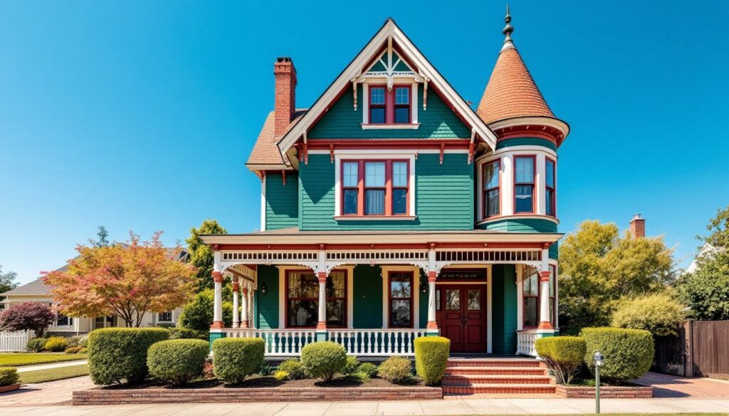
Painted Ladies: Bold Multi-Color Approaches
The term “Painted Lady” refers to Queen Anne and Stick-style Victorians with three or more colors highlighting architectural flourishes. San Francisco’s Alamo Square row is the iconic example, but the approach works on any ornate Victorian exterior.
Typical four-color breakdown:
- Body/Field Color: Medium to dark base, forest green, burgundy, slate blue, or chocolate brown. Covers clapboard or shingles.
- Primary Trim: Windows, cornerboards, fascia, often a contrasting lighter or complementary hue like cream, buff, or soft yellow.
- Secondary Trim/Accent: Spindles, brackets, porch railings. A pop of contrast: coral, teal, plum, or gold.
- Sash/Detail: Window sash, decorative panels, or gable ornaments. Sometimes black, deep red, or a metallic.
Historically accurate victorian exterior paint colors for Painted Ladies include:
- Body: Mossy green or terra cotta
- Primary trim: Creamy ivory or warm tan
- Accent: Brick red or Prussian blue
- Detail: Deep maroon or charcoal
When executing a multi-color scheme, test samples on different elevations. North-facing surfaces read darker: south-facing can wash out lighter tones. Use exterior acrylic latex in at least a satin sheen for trim (easier to clean) and flat or low-luster for clapboard to minimize imperfections.
Safety note: If your Victorian was built before 1978, assume lead paint. Wet-scrape or use a chemical stripper: never dry-sand. Wear a NIOSH-rated respirator and containment tarps.
Subtle Victorian Palettes for Modern Tastes
Not every homeowner wants a six-color showpiece. Subtle schemes honor Victorian bones without announcing “Look at me” from three blocks away.
Two- to three-color approaches:
- Monochromatic with contrast trim: Soft gray body, charcoal trim, white sash. Clean, restrained, highlights proportion over ornament.
- Analogous harmonies: Sage green body, olive trim, cream accents. Feels organic, less formal.
- Neutral + one bold accent: Taupe body and trim, with front door and gable details in deep teal or burgundy.
These victorian house exterior color schemes appeal to neighborhoods with design review boards or homeowners associations that frown on high contrast. They’re also easier to repaint, fewer masking transitions, less labor.
One effective modern interpretation uses heritage-brand palettes like Sherwin-Williams’ Historic Color Collection or Benjamin Moore’s Williamsburg line, which include documented Victorian-era hues reformulated in today’s low-VOC acrylics. Coverage typically runs 350–400 square feet per gallon for body coats: plan on two coats over properly primed surfaces.
Interior Victorian Color Combinations
Victorian interiors leaned darker and richer than exteriors, especially in formal rooms. Wallpaper was king, but paint played a supporting role on trim, ceilings, and sometimes full walls.
Common interior palettes by room function:
- Parlors/Drawing Rooms: Deep burgundy, forest green, or navy walls: cream or gold trim: ceilings often off-white or pale blue to reflect gaslight (later electric light).
- Dining Rooms: Warm reds, burnt orange, or chocolate brown to create intimacy: dark-stained wainscoting or chair rail.
- Libraries/Studies: Hunter green, claret, or charcoal: built-in shelving in natural wood or painted to match trim.
- Bedrooms: Softer shades, dusty rose, lavender, sage, reserved for private spaces. Less about show, more about comfort.
- Kitchens/Service Areas: Practical whites, grays, or pale yellows: utilitarian rather than decorative.
Trim and ceiling treatment:
Victorians often used oil-based enamels on baseboards, door casings, and crown molding for durability and a smooth, lustrous finish. Modern acrylic enamel or hybrid alkyd paints deliver similar hardness without the long dry times or strong odor. Apply with a fine-bristle brush or foam roller for baseboards to avoid stipple.
Ceilings weren’t always white. Lighter tints of wall color or delicate patterns stenciled around ceiling medallions were period-appropriate. If historical accuracy matters less than livability, designers at renovation-focused sites often recommend keeping ceilings neutral to prevent rooms from feeling cave-like under modern LED lighting.
Finish sheen matters indoors:
- Flat/Matte on ceilings hides imperfections.
- Eggshell on walls balances cleanability with low glare.
- Semi-gloss or gloss on trim and doors resists scuffs and wipes clean.
Test colors in the actual room at different times of day. Victorian-era gaslighting was warm and dim: today’s full-spectrum LEDs can shift how deep reds and greens appear.
How to Choose the Right Victorian Color Scheme for Your Home
Selecting colors requires balancing historical authenticity, neighborhood context, personal taste, and practical maintenance.
Steps to narrow your palette:
- Identify your substyle. Queen Anne, Italianate, Second Empire, Stick, and Folk Victorian each have signature color tendencies. A high-contrast polychrome scheme suits ornate Queen Annes: restrained earth tones fit simpler Folk Victorians.
- Survey the neighborhood. If you’re on a historic block, coordinate (not match) with adjacent homes. Wildly divergent schemes can hurt resale or trigger design review pushback.
- Assess architectural detail. More ornament = more opportunity (and need) for accent colors. A plain two-story with minimal trim won’t benefit from five hues.
- Check local paint history. Some cities (San Francisco, Cape May, Savannah) have published color studies documenting original schemes. County historical societies or preservation offices may have records.
- Factor in maintenance. Dark colors fade faster in intense sun: high-gloss finishes show every dent. Coastal climates demand mildew-resistant formulas. If you’re DIYing, simpler schemes mean fewer masking sessions and less leftover paint.
Sample before committing:
Buy quart-size samples and paint 2′ × 2′ test patches on different façades (east, west, north, south). Live with them for a week. Colors shift dramatically from dawn to dusk and under overcast skies. For interiors inspired by luxury home palettes, test in the room’s actual lighting, never just on a poster board.
When to call a pro:
If your Victorian has intricate gingerbread, fish-scale shingles, or hard-to-reach gables, hiring a professional painter experienced in historic homes can save time and ensure even coverage on complex surfaces. Pros also carry scaffold or lift equipment and know how to work around original wavy glass and delicate trim.
Permits generally aren’t required for repainting (cosmetic work), but if you’re in a historic district, design review may be mandatory before changing exterior colors. Check with your local planning or historic preservation office before you buy the first gallon.
Conclusion
Victorian color schemes offer endless creative latitude, from exuberant multi-hue exteriors that celebrate every bracket and spindle to restrained interiors that ground ornate architecture in livable elegance. Whether chasing period accuracy or crafting a modern interpretation, success comes down to understanding the era’s principles, respecting your home’s architectural bones, and choosing quality materials that stand up to real-world wear. Sample thoroughly, prep properly, and don’t skip the primer. Your Victorian deserves more than a quick coat of whatever’s on sale.