Table of Contents
ToggleDark brown brick brings depth and warmth to a home’s exterior, but choosing the right color scheme can make the difference between a house that blends into the background and one that stands out on the block. Whether you’re planning a full exterior refresh or just updating trim and shutters, the right palette will enhance the natural richness of the brick without fighting against it. This guide walks through practical, field-tested color combinations that work with dark brown brick, from safe classics to bold modern choices. No Pinterest fluff here, just combinations that work in real neighborhoods with real budgets.
Key Takeaways
- Dark brown brick color schemes work best when trim contrasts thoughtfully with the brick’s undertones—soft whites and creams offer elegance while charcoal provides modern edge.
- Test paint samples at different times of day and in various lighting conditions, as dark brown brick absorbs light and can appear muddy on shaded elevations without adequate contrast.
- Front door colors like navy blue, burgundy, or forest green serve as affordable accent pieces that define the entire exterior aesthetic without requiring extensive material investment.
- Match shutters to your front door color rather than trim to create visual layering and intentional design, or skip non-functional shutters altogether to avoid cheapening the home’s curb appeal.
- Dark brown brick pairs most reliably with charcoal, black, or warm-toned roofing, while light gray and tan roofs create washed-out, indecisive looks that clash with the brick’s richness.
- Exterior-grade acrylic latex paint with satin or semi-gloss sheen is essential for trim durability, while doors require acrylic enamel and bonding primer to withstand weather and UV exposure.
Understanding the Appeal of Dark Brown Brick
Dark brown brick sits in that rare spot where traditional meets contemporary. It’s got the timeless durability of brick masonry but with enough color variation to support both warm and cool accent palettes. Most dark brown brick isn’t a single color, look closely and you’ll see flecks of rust red, charcoal, and sometimes even purple-gray. That variation is your advantage when selecting complementary colors.
Unlike red brick, which can skew dated without the right treatment, dark brown brick reads more neutral. It doesn’t scream “1970s ranch” the way orange-red brick can. This makes it easier to pivot between design styles, Craftsman, modern farmhouse, or even industrial, without replacing the entire facade.
The key challenge? Dark brown brick absorbs light. On north-facing elevations or heavily shaded lots, the brick can look muddy or flat without enough contrast from trim, doors, and accents. Plan your palette with lighting in mind: test paint samples at different times of day and check how they read in morning shadows versus late afternoon sun. A color that looks sharp at noon might disappear at dusk.
Another consideration is undertone. Some dark brown bricks lean warm (with rust or amber notes), while others trend cool (with gray or taupe). Hold paint chips directly against the brick in natural light to see whether your trim color harmonizes or clashes with the brick’s undertone.
Best Exterior Trim Colors for Dark Brown Brick
Trim color is your biggest lever for shaping the overall look. Get it right and the whole house coheres: get it wrong and even quality brick looks cheap.
Classic White and Cream Trim Options
Bright white (think Benjamin Moore’s Chantilly Lace or Sherwin-Williams Extra White) delivers maximum contrast. It’s crisp, clean, and makes dark brown brick pop, but it’s also high maintenance. Bright white shows every splash of mud, every pollen season, and every cobweb. If your lot backs onto woods or unpaved areas, expect to pressure-wash trim at least twice a year.
Soft white or cream (like Benjamin Moore White Dove or Sherwin-Williams Alabaster) offers a gentler contrast that’s more forgiving. These warmer whites complement the amber undertones in many dark brown bricks without the stark “hospital clean” look. They also hide dirt better and age more gracefully between cleanings. Cream tones work especially well on homes with traditional Southern porch details, where high-contrast white can feel too stark.
For fascia, soffits, and window casings, use exterior-grade acrylic latex with a satin or semi-gloss sheen. Flat paint on trim collects grime and can’t be scrubbed. Coverage typically runs 350-400 square feet per gallon for quality paint on primed wood.
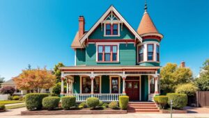
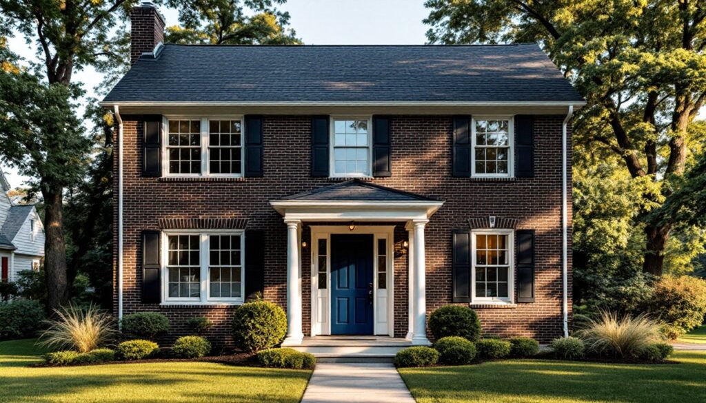
Bold Black and Charcoal Accents
Black trim flips the script entirely. Instead of contrast, you’re leaning into drama and modern edge. Tricorn Black (Sherwin-Williams) or Wrought Iron (Benjamin Moore) can make dark brown brick feel sophisticated rather than dated, but you need other elements to break up the darkness.
This approach works best when you add a bold front door color (more on that below) and use black selectively: window frames, shutters, and maybe garage doors, but not necessarily every trim element. All-black trim on a heavily shaded house can read as a dark blob from the curb.
Charcoal gray (such as Kendall Charcoal or Iron Ore) splits the difference. It offers modern contrast without going full goth. Charcoal pairs especially well with cool-toned dark brown brick that has gray flecking. It’s also more practical in hot climates, where black surfaces can heat up enough to affect nearby plantings or cause paint to blister.
Front Door Color Ideas That Pop Against Dark Brick
The front door is your accent piece, the one place you can take a real color risk without committing to gallons of paint or expensive materials.
Rich red or burgundy plays off the warm undertones in dark brown brick. Think Caliente (Sherwin-Williams) or a deep brick red. This combo feels classic and welcoming without looking dated. It works well on Colonial, Craftsman, or traditional two-story homes.
Navy blue is a safe but stylish choice. It’s got enough depth to hold its own against dark brick but won’t clash with either warm or cool undertones. Try Naval (Sherwin-Williams) or Hale Navy (Benjamin Moore). Navy pairs especially well when you’ve used white or cream trim, it bridges the gap between light and dark.
Forest green or hunter green leans traditional but not boring. It’s understated enough for conservative neighborhoods but has more personality than beige. This works particularly well if you’ve got substantial landscaping or mature trees framing the entry.
For something more adventurous, teal or turquoise can work if your brick has cooler undertones. It’s unexpected against brown but doesn’t fight the way orange or hot pink might. Test this one carefully, it can look amazing or terrible depending on your specific brick color.
Matte black is the minimalist’s choice. It disappears into a dark palette but adds a modern edge, especially when paired with black hardware, house numbers, and a simple horizontal-grain door. This approach suits contemporary or mid-century modern homes more than traditional styles.
Use exterior-grade acrylic enamel on doors, not standard wall paint. Doors take more abuse from weather, UV exposure, and physical contact. Plan for at least two coats over a bonding primer for lasting coverage.
Choosing the Right Shutter and Accent Colors
Shutters can either tie your color scheme together or turn into afterthoughts. The decision starts with whether your home even needs them, functionally or aesthetically.
If your windows have no room for shutters to actually close over them, consider skipping them entirely. Fake shutters that are clearly non-functional (too small, no hardware, mounted on siding that wouldn’t allow them to swing) cheapen the look. But if your home’s style calls for them or they’re already there and in good shape, paint them to complement, not match, your trim.
Matching shutters to trim is safe but can flatten the facade. There’s no layering, no visual interest. Instead, try matching shutters to your front door. This creates a cohesive accent color that draws the eye and makes the entry feel intentional. If your door is navy, paint the shutters navy. If your door is burgundy, go with burgundy shutters.
Another option: charcoal or black shutters with white trim. This high-contrast combo is sharp and reads well from the street. It works especially well on homes inspired by modern exterior color palettes that lean into graphic contrast.
For homes with light brown brick accents or a mix of brick tones, matching the shutters to the darkest brick color unifies the facade and makes the color scheme feel deliberate rather than patched together.
If you’re installing new shutters, use exterior-grade vinyl or composite materials that won’t warp, rot, or require frequent repainting. Real wood shutters are an upgrade but need maintenance, expect to repaint every 3-5 years depending on exposure. Properly sized shutters should equal half the width of the window they flank.
Coordinating Roof Colors With Dark Brown Brick
Roof color locks in your palette’s overall tone, warm or cool, traditional or modern. It’s also the hardest and most expensive element to change, so get it right the first time.
Charcoal or black roofing (asphalt shingles in Charcoal or Onyx Black) is the most common pairing with dark brown brick. It’s a safe, versatile choice that works with nearly any trim and accent color. Charcoal roofs also hide dirt, algae stains, and minor damage better than lighter colors. Expect architectural-grade shingles to last 25-30 years with minimal maintenance.
Medium brown or weathered wood tones create a warm, cohesive look. This works especially well if your brick leans toward rust or amber undertones. The downside: brown roofs show streaking and organic growth more than dark gray, and they’re harder to match if you need to replace sections after storm damage.
Dark green roofing (such as Hunter Green or Forest) can work on homes with significant tree coverage or in wooded settings. It blends the house into its surroundings and pairs nicely with cream trim and a red or navy door. It’s uncommon enough to stand out but not so bold that it limits your other color choices.
Avoid light gray or tan roofing with dark brown brick, it creates a washed-out, indecisive look. And unless you’re going for a specific regional style (like the red clay tiles common in Southern home design or Mediterranean architecture), skip roof colors that fight the brick’s undertones.
If you’re re-roofing, this is the time to address attic ventilation, ice-and-water shield installation, and flashing details. Check local building codes for underlayment requirements, many jurisdictions now mandate synthetic underlayment in place of traditional felt paper. That typically adds $100-200 to material costs for an average-sized roof but improves longevity and weather resistance.
Roof color also affects energy efficiency. Dark roofs absorb more heat, which can increase cooling costs in hot climates but help with snow melt in cold regions. If energy efficiency is a priority, consider cool-roof shingles with reflective granules, they come in dark colors but reflect more IR radiation than standard shingles.